How to create a box and whisker plot in Excel

A box plot or boxplot is a method to display the spread and skewness for a given set of data using the five numbers summary principle:

- Minimum: The smallest value in a data set.
- First quartile: The middle value between the Minimum and Median—25th percentile.
- Median: The middle value of a data set.
- Third quartile: The middle value between the Median and the Maximum—75th percentile.
- Maximum: The largest value in a data set.
In the box and whisker plot, the lower box edge corresponds to the first quartile, and the upper box edge corresponds to the third quartile. The line through the center is the median. The whiskers go from each quartile to the minimum or maximum values.
The 'five-number summary' principle provides a concise statistical summary for a particular set of numbers. It shows the range (minimum and maximum numbers), the spread (upper and lower quartiles), and the center (median) for the given set of data numbers.
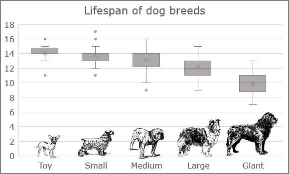
Box-and-whiskers plots are an excellent way to visualize differences among groups. For example, there are five groups of the dog breeds by size:
- Toy - up to 12 pounds
- Small - 12 to 25 pounds
- Medium - 25 to 50 pounds
- Large - 50 to 100 pounds
- Extra Large (Giant) - over 100 pounds
The boxplot shows that larger dogs have a shorter lifetime compared to the smaller ones.
To create a box and whisker chart in Excel, do the following:
1. Select the data.
Note: To ensure that the chart is created correctly, the first column of your data should contain the correct categories in the necessary order. These categories are used for creating different boxes with whiskers. Thus, before creating a chart, select the data, and sort it by the order that you need for the chart.
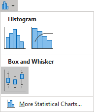
2. On the Insert tab, in the Charts group, click the Insert Statistic Chart button:

From the Insert Statistic Chart dropdown list, select Box and Whisker:

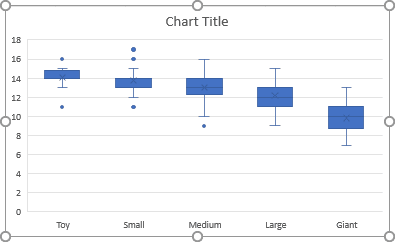
Excel creates a box and whisker chart from your data:

Make any other adjustments you want.
Use Box and Whisker Chart when:
- You want to observe the upper, lower quartiles, mean, median, deviations, etc. for a large dataset.
- You want to see a quick view of the dataset distribution.
- You have multiple data sets that come from independent sources and relate to each other in an unknown way.
- You need to compare data from different categories.

