Funny and amusing charts for your next presentation
Excel
365
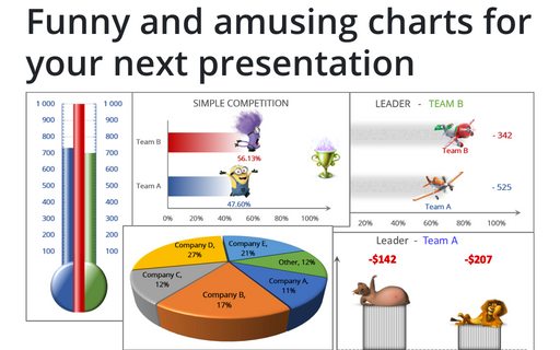
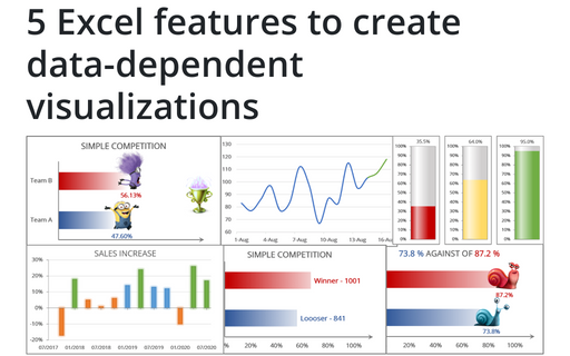
Several different Excel features can make your presentation less boring:
1. You can add funny pictures and attach them to the data bars
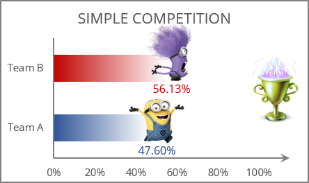
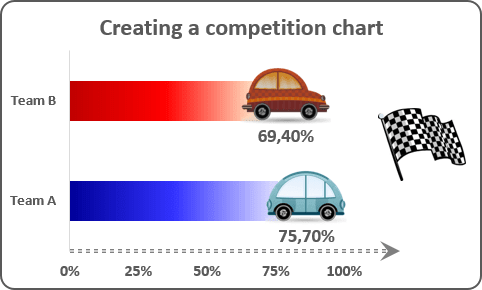
See Creating a simple competition chart in Excel for Microsoft 365, and Creating a simple competition chart in Excel 2016 for more details.
2. You can use a thermometer-like chart for illustration of the team performance
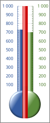
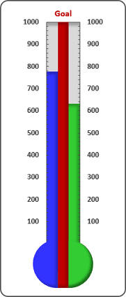
See Creating a twin or double thermometer chart in Excel for Microsoft 365, and Creating a twin or double thermometer chart in Excel 2016 for more details.
3. You can display remaining points, amounts, etc. that are left to achieve the goal
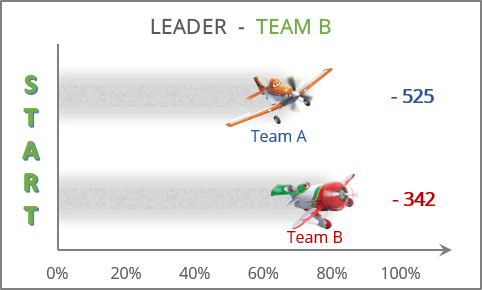
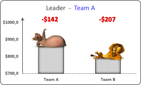
See Competition chart with residual data in Excel for Microsoft 365, and Competition chart with residual data in Excel 2016 for more details.
4. You can create a 3-D pie chart that adds some depth to your data and helps to hide some issues
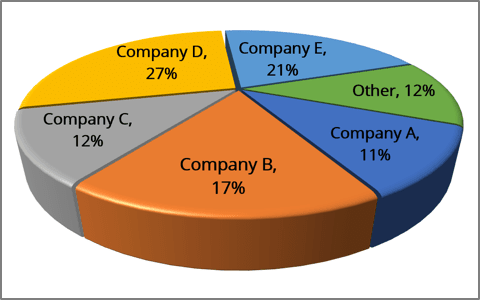
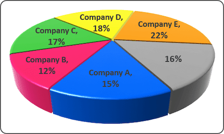
See Excel 3-D Pie charts in Excel for Microsoft 365, and Excel 3-D Pie charts in Excel 2016 for more details.
See also this tip in French: Des graphiques amusants et divertissants pour votre prochaine présentation.
