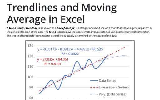
Format trendlines and Moving Average
Like Excel objects, you can fine-tune the trendline settings on the Format Trendline pane:
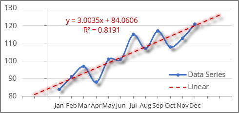
To open the Format Trendline pane, right-click on the existing trend line and choose Format Trendline... in the popup menu (or double-click the trend line):
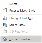
Customize a trend line fill and effects
On the Format Trendline pane, on the Trendline Options tab:
- In the Fill & Line group, specify the color, transparency, width, etc. for the trendline:

See more about filling options in Microsoft applications.
- In the Effects group, specify some effects for the trend line such as Shadow, Glow, and Soft Edges in appropriate sections:

Excel applies the chosen formatting to the trendline:

Change the trend line type
On the Format Trendline pane, on the Trendline Options tab, in the Trendline Options group, under Trendline Options, you can change the trendline type or trendline options, such as the Order for the Polynomial trend line or the Periods for the Moving Average trend:
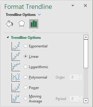
See more about trendline types.
To customize a trend line legend
On the Format Trendline pane, on the Trendline Options tab, under Trendline Name:
- Select the Custom option,
- Specify a Trendline name for the chart legend:
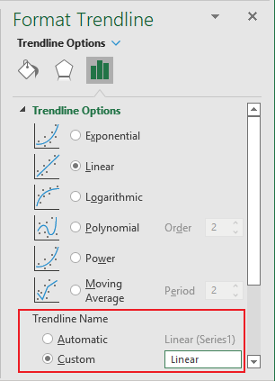
This custom trendline name will be shown in the chart instead of the automatically generated one (see examples above).
Extend a trendline
On the Format Trendline pane, on the Trendline Options tab, under Forecast, change or specify the number of periods that you want to forecast:
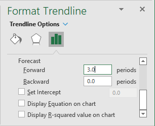
- Type or select a value in the Forward field to project your data into the future (this option works for all trendline types):

- Type or select a value in the Backward field to project your data into the past (this option only works for XY scatter chart, Excel ignores the entered data in this field for any other chart types):

Apply intercept
The Intercept is a value on the value axis where the trendline crosses the Y axis.
Note: Excel offers the INTERCEPT () function that, for given data, calculates a value on the Y axis - usually the vertical (Value) axis, where the trend line should pass. See more about the INTERCEPT () function:
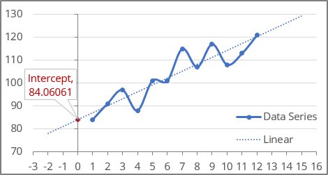
To set the intercept, on the Format Trendline pane, on the Trendline Options tab, under Trendline Name, type or select the appropriate value in the Set Intercept field:
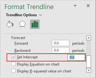
Note: You can do this only when you use an exponential, linear, or polynomial trendline.
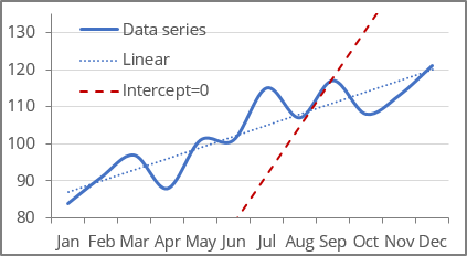
For example, the chart with two linear trendlines:
- The first one with calculated intercept,
- The second one with the intercept = 0:
Display the trendline equation on the chart
The trendline equation is a mathematical formula that describes a trendline. Excel uses the least squares method to find the best fit for a line through data points - see more about the calculation of trend values.
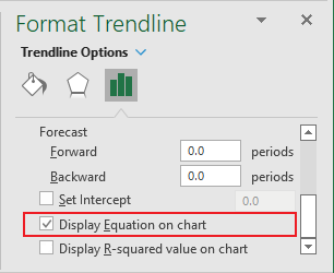
To add an equation to the chart, on the Format Trendline pane, on the Trendline Options tab, at the bottom of the Trendline Options group, select the Display Equation on chart checkbox:
Note: You can display trendline equations for all trendline types except for the Moving Average:
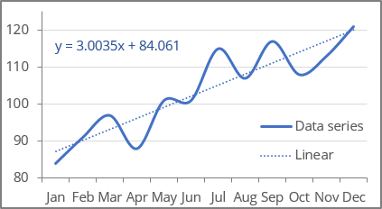
See how to format the chart equation below.
Display the R-squared value on a chart
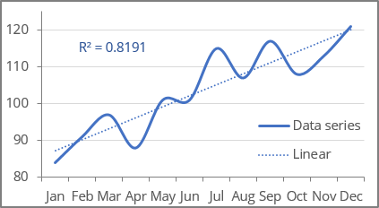
The R-squared value (in Excel, R2) is used to analyze how well the trendline corresponds to the data series. The R-squared value is a number from 0 to 1. The closer R2 is to 1, the closer the trendline is to the data points. An exactly matching model has R2 equal to 1.
To add the R-squared value to the chart, on the Format Trendline pane, on the Trendline Options tab, at the bottom of the Trendline Options group, select the Display R-squared value on chart checkbox:
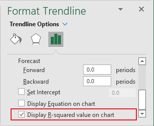
Note: You can display an R-squared value for all the trendline types except for the Moving Average:
Format chart equation and R-squared value
Excel adds the equation and R-squared value with parameters by default. You can easily customize them:
- To change the position of the equation and R-squared value on the chart, click on the corresponding text and drag the textbox using the mouse.
- Format the textbox of the equation and R-squared value as a regular text box:
- Change the text color, size, add effects, etc.
- Change the filling options, add effects, border color, weight, type, etc.
- To display more or less decimal places on the equation or R-squared value when displaying on a chart, do the following:
- Double-click the text box to open the Format Trendline Label pane.
- On the Format Trendline Label pane, on the Label Options tab, in the Label Options group, in the Number section:
- From the Category list, select Number,
- In the Decimal places field, type the number of decimal places you want to see on the coefficients in the equation and R-squared value:

- Press Enter to update the text box.
For example, with 8 decimal points:


