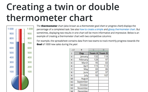
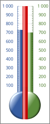
Creating a twin or double thermometer chart
For example, the spreadsheet contains data from two teams to track monthly progress towards the Goal of 1000 new sales during the year:
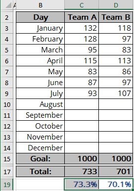
Cells C15 and D15 contain the goal value, and cells C17 and D17 contain a simple sum formula for each team:
C17: = SUM (C3:C14) and D17: = SUM (D3:D14)
Cells C19 and D19 contain a formula that calculates the percent of the Goal for each team:
C19: = C17 / C15 and D19: = D17 / D15.
The formulas display the current results when you enter new data in columns C or D.
To create a chart like the one above, do the following:
Create a simple column chart
1. Select cells C19 and D19 if you want to create a percentage axis, or select cells C15, C17, and D17 if you want to create a volume axis.
2. On the Insert tab, in the Charts group, click the Insert Bar or Column Chart button:

Choose Clustered Column:
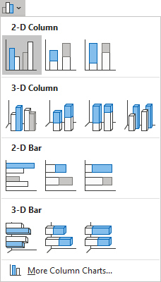
Excel creates a simple column chart:
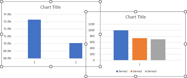
Format the chart
3. Remove unnecessary chart elements such as the horizontal (Category) axis, gridlines, legend, and chart title.
To remove any of these chart elements, select it and click the Delete key. See how to select chart elements for more details.
Modify the chart data
4. Right-click on any data series and choose Select Data... in the popup menu:
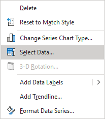
In the Select Data Source dialog box:
- For the first variant with the percentage values:
- Switch the data if needed by clicking the Switch Row/Column button:
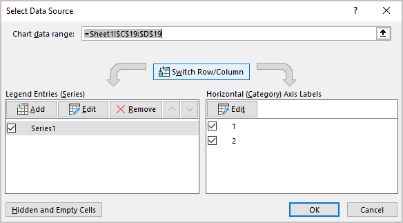
- Add a new data series for the Goal if you want to create a percentage axis (for example, with the fixed value = 100%):
- Under Legend Entries (Series), click the Add button,
- In the Edit Series dialog box, in the Series values field:
- Select the appropriate cell or
- Type the fixed value (leave the proposed value = {1} for the 100%):
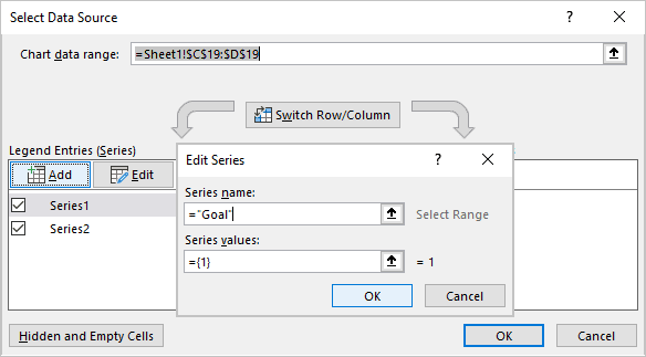
- Switch the data if needed by clicking the Switch Row/Column button:
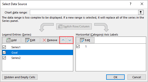
- Reorganize data series to have a Goal between the other data series by clicking the Move Up and Move Down buttons:
Add the secondary vertical axis
5. To make marks for the primary and secondary vertical axes, do one of the following:
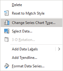
- Right-click on any chart data series and select Change Series Chart Type... in the popup menu:
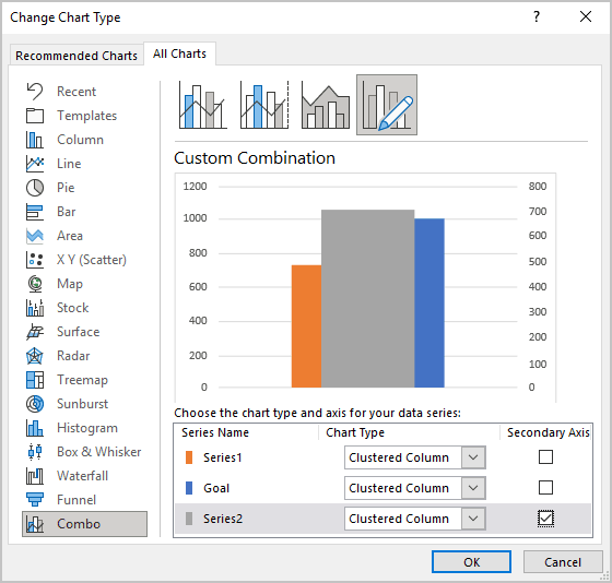
In the Change Chart Type dialog box, select the Secondary Axis for the Series2:
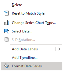
- Right-click on the Series2 data series and choose Format Data Series... in the popup menu:
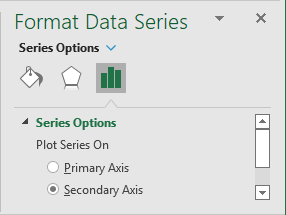
On the Format Data Series pane, on the Series Options tab, under Plot Series On, select the Secondary Axis option:
Format vertical axes
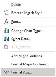
6. Right-click on the primary vertical axis and choose Format Axis... in the popup menu (or double-click the axis):
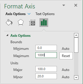
On the Format Axis pane, on the Axis Options tab:
- In the Axis Options group:
- In the Minimum field, type 0,
- In the Maximum field, type:
- 1 as a 100% if you use a percentage axis,
- The Goal value if you use a volume axis (for this example, 1000):
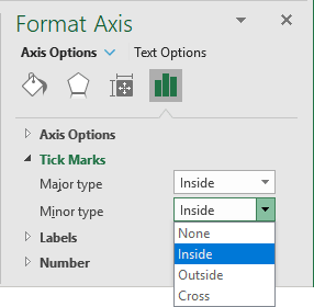
- In the Tick Marks group, select the Inside option in both Major type and Minor type dropdown lists:
Make other adjustments, such as changing the line and label color and width. You can also hide the zero point in the axis (see How to hide points on the chart axis).
Repeat step 6 customization for the secondary vertical axis to make them symmetrical.
Format chart data series
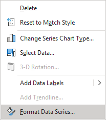
7. To make columns occupy the entire width of the plot area, right-click on any data series but the Goal, and choose Format Data Series... in the popup menu:
On the Format Data Series pane, on the Series Options tab, change the Series Overlap and Gap Width setting:
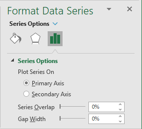
For this example, set both to 0.
Add shapes
8. On the Insert tab, in the Illustrations group, select Shapes:
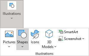
On the Shapes list, in the Basic Shapes group, choose the shapes that you want to add to the chart. Format shapes, and insert the data label if you want (see How to insert cell content to the shape).
You can then make any other adjustments to get the look you desire.
See also this tip in French: Comment créer un graphique de thermomètre double.
