Using two axes in one chart
For example, if you have two too different data (e.g., volume and price), which you want to see in one chart:
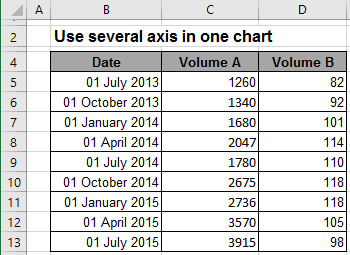
To create one chart for this data, follow these steps:
1. Create the chart with that data range:
For example, on the Insert tab, in the Charts group, choose the Column button:

Choose the Clustered Column
 chart.
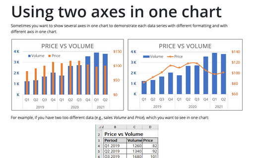
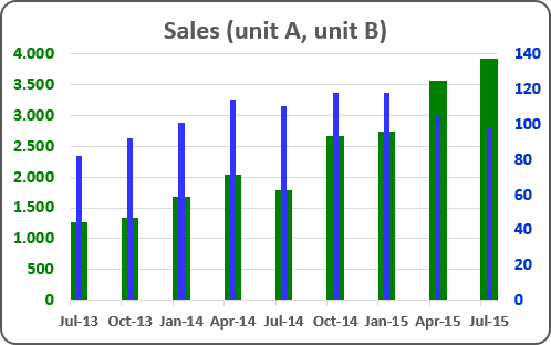
You can see not informative chart because of too different amounts:
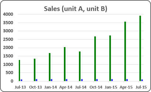
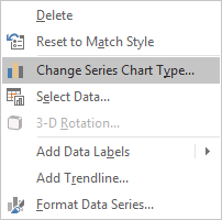
2. Right-click in the second (Price) data series, in the popup menu select Change Series Chart Type...:
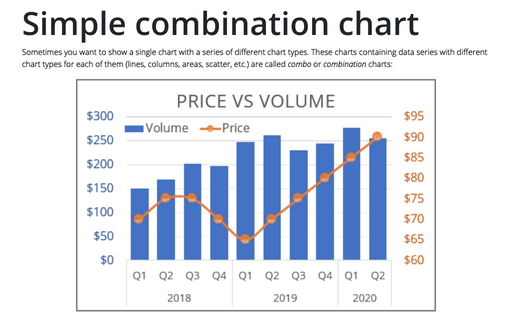
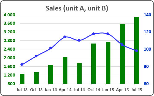
3. In the Change Chart Type dialog box, in the Combo group of charts, choose the secondary axis for second data series:
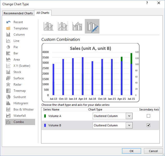
Note: In this dialog box, you can change the chart type for each data series.
Change other parameters for the secondary axis.
How to add next data series with another axis, see Combining several charts into one chart.
See also this tip in French: Comment utiliser deux axes dans un graphique.
