Simple combination chart

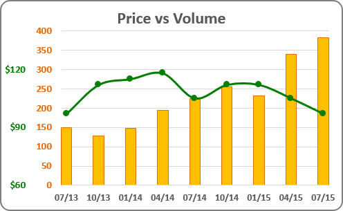
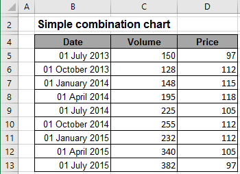
For example, if you have two different volumes (e.g., the volume of sales and the product price) and you want to see in one chart the dynamic of their sales:

To create one chart for this data, follow these steps:
1. Select the data range (in this example - cells B4:D13).
2. On the Insert tab, in the Charts group, click Combo:

3. In the proposed list, choose Clustered Column - Line in Secondary Axis.
4. Modify this chart.
How to add the next data series with another axis, see Combining several charts into one chart.
See also this tip in French: Comment créer le graphique de combinaison simple.

