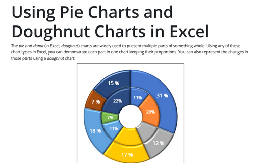
Using Pie Charts and Doughnut Charts in Excel
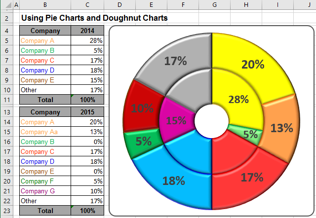
For example:
- if you have several companies that operate in one business, you can submit a part of every
company in this business:

- after the merger of some companies have received:

To create one chart of this data, follow these steps:
1. Select the first data range (in this example, B5:C10).
2. On the Insert tab, in the Charts group, select the Pie and Doughnut button:

In the Pie and Doughnut dropdown list, choose the Doughnut
 chart.
3. Right-click in the chart area and do one of the following:
- Under Chart Tools, on the Design tab, in the Data group, choose Select Data:

- Right-click in the chart area and choose Select Data... in the popup menu:
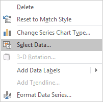
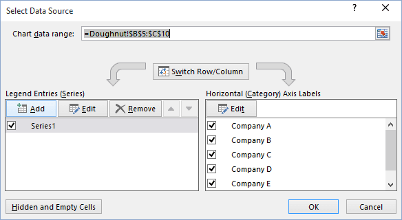
4. In the Select Data Source dialog box, click the Add button:
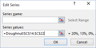
5. In the Edit Series dialog box, select the second data range (in this example, C14:C22):
After adding the new data series, your doughnut chart can be like this:
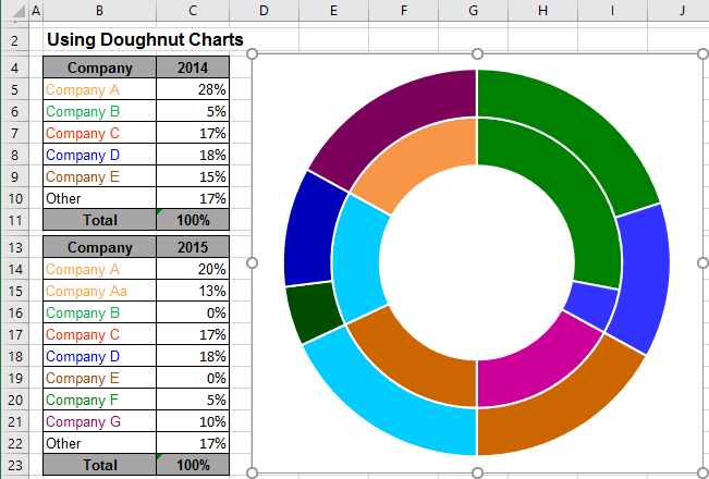
You can then make any other adjustments to get the look you desire.
See also this tip in French: Utiliser le graphique en secteurs ou en anneau dans Excel.
