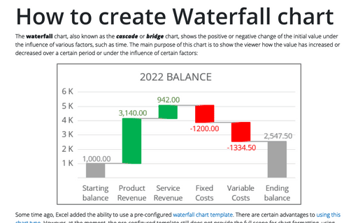
How to create Waterfall chart
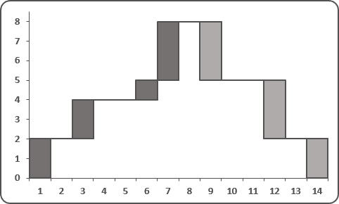
To create a simple waterfall chart, do the following:
1. Add three columns with "Y empty" data, "Y plus" data and "Y minus" data (you can add a column for empty data and a new column with independent data for every unique color in you waterfall chart), where:
D: = IF (C6 > C5, C5, C6), E: = IF (C6 > C5, C6 - C5, 0), and F: = IF (C6 > C5, 0, C5 - C6)
2. Add rows with empty "Y" data, if necessary (in this example 6, 8, 9, 12, 14, 15 and 17) and then add two columns for continuous line (see in step 7).
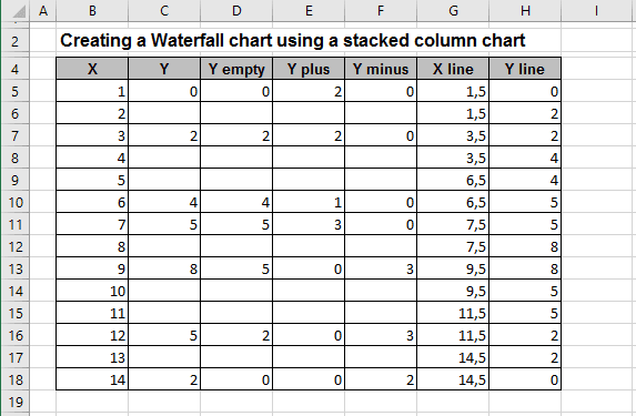
3. Select the data range (in this example D5:F18).
4. On the Insert tab, in the Charts group, choose the Column button:

Choose Stacked Column.
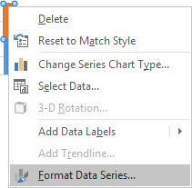
5. Right-click in the any of first series column and choose Format Data Series...:
6. On the Format Data Series task pane, in the Fill group, select No fill option:
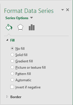
You can then make any other adjustments to get the look you desire.
7. To add the continuous line, do the following:
- Right-click in the chart area and choose Select Data... in the popup menu:
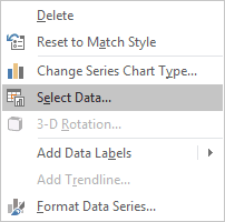
- In the Select Data Source dialog box, click the Add button:

- In the Edit Series dialog box, choose the line points (in this example
H5:H18):

- Right-click in the chart area and choose Change Series Chart Type... in the popup menu:

- In the Change Series Chart Type dialog box, choose Combo and then Custom
Combination:

Choose other parameters like you want.
- Edit data source for add "X" points (repeat steps 1-3, only in step 2 click the Edit button):

- Format this line.
