How to compare strengths and weaknesses, skills, or performance metrics
A much better option is to normalize the data and use a spider chart, which renders multiple axes with the same scale.

Spider charts are also known as radar charts, web charts, star plots, irregular polygons, polar charts, cobweb charts, or Kiviat diagrams.
To create a spider chart, do the following:
1. Select the chart data.
For example, for comparing the soft skills of two candidates:

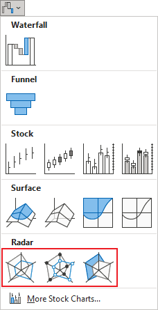
2. On the Insert tab, in the Charts group, click the Insert Waterfall, Funnel, Stock, Surface, or Radar Chart dropdown list:

Select the Radar, Radar with Markers, or Filled Radar:

Excel creates the chart from your data:

The picture above shows, as an example, the soft-skills comparison of two people. HR departments often use spider web charts based on supervisor's rankings plan promotions or to build skill improvement plans. Beware, people's estimates calibration differs from person to person in question. You need to average rankings from multiple people - supervisors at various levels, peers, etc.
See also this tip in French: Comment comparer les forces et les faiblesses, les compétences ou les indicateurs de performance.

