Format in Excel 365
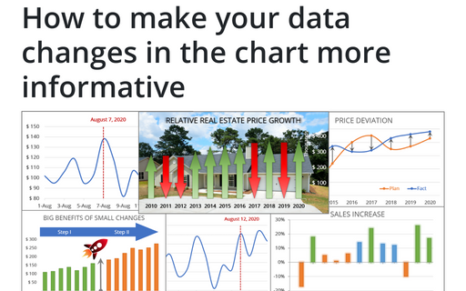
How to make your data changes in the chart more informative
Simple line and bar charts often attract little or no interest in the audience. Still, Excel allows you to attract attention to your data by emphasizing change direction, difference, or period.
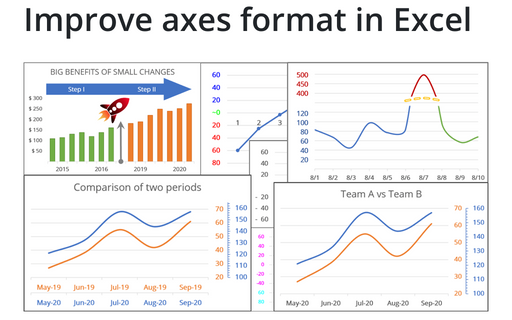
Improve axes format in Excel
Very few Excel users pay attention to the chart axes, but there are some tricks with axes that will help you to improve your visualizations with little or no efforts.
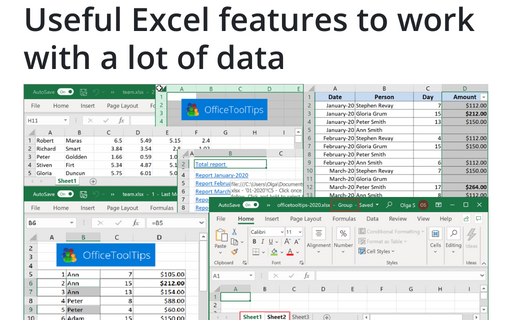
Useful Excel features to work with a lot of data
If you have a lot of data, manual editing and formatting of cells isn't an option anymore. However, Excel
provides many group operations that make those manipulations quick and easy.
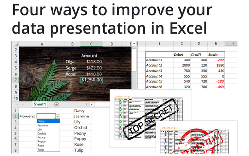
Four ways to improve your data presentation in Excel
Using simple tricks, you can convert your Excel spreadsheet from a table with rows and columns to an
interactive application that will help you represent the data more appealingly and conveniently.
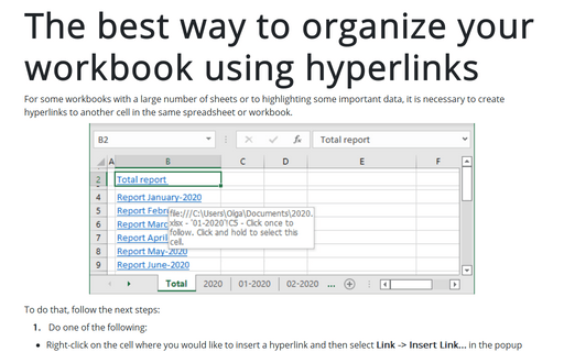
The best way to organize your workbook using hyperlinks
For some workbooks with a large number of sheets or highlighting some important data, it is necessary to create hyperlinks to another cell in the same spreadsheet or workbook.
Copy and paste only nonblank cells
Unfortunately, when you try to paste a series of cells with blank cells, the Paste special with Skip blanks option doesn't seem to work.
Unmerging all merged cells
Here's a quick way to unmerge all merged cells in a worksheet:
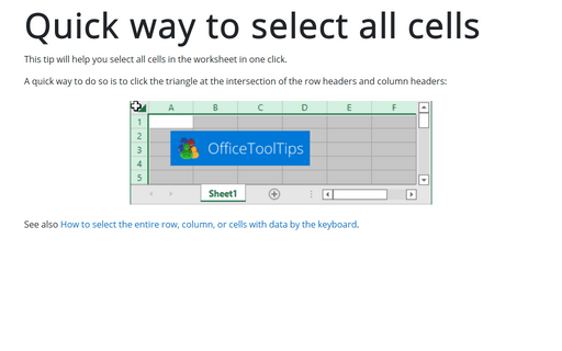
Quick way to select all cells
This tip will help you select all cells in the worksheet in one click.
A quick way to duplicate all of the custom chart formatting
The creation of a large number of visually consistent charts to represent different data is a time consuming and error prone task unless you know how to copy formatting between charts.
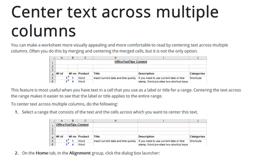
Center text across multiple columns
You can make a worksheet more visually appealing and more comfortable to read by centering text across multiple columns. Often you do this by merging and centering the merged cells, but it is not the only option.
