How to create PowerPoint progress pie chart
See also How to create an Arc length chart in PowerPoint.

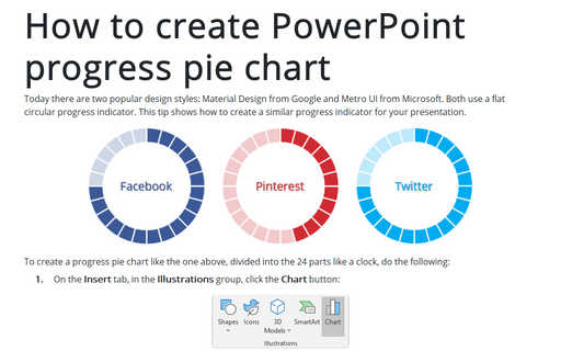
To create a progress pie chart like the one above, divided into the 24 parts like a clock, do the following:
1. On the Insert tab, in the Illustrations group, click the Chart button:

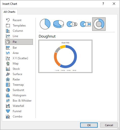
2. In the Insert Chart dialog box, on the Pie tab, choose the Doughnut chart:
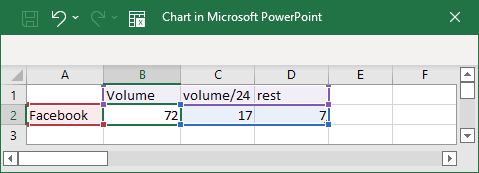
3. In the Chart in Microsoft PowerPoint dialog box, enter the data stream with the volume and two formulas:
volume/24 = volume / (100 / 24) (you may choose any other number of parts)
rest = 100 / 24 - volume:
4. Choose colors for the added pie chart, for example:
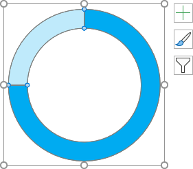
5. Add the new pie chart for borders:
5.1. On the Insert tab, in the Illustrations group, click the Chart button.
5.2. In the Insert Chart dialog box, on the Pie tab, choose the Doughnut chart.
5.3. In the Chart in Microsoft PowerPoint dialog box, enter the data stream for 24 parts:

5.4. On the Chart Design tab, in the Data group, click on the Select Data button:

5.5. On the Select Data Source dialog box, click on the Switch Row/Column button:
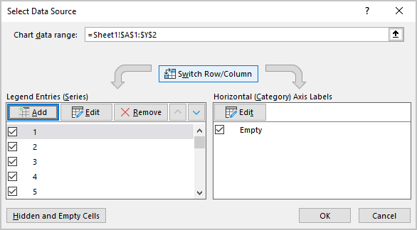
The new pie chart should look like:

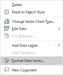
5.6. Right-click on your chart data and choose Format Data Series... in the popup menu:
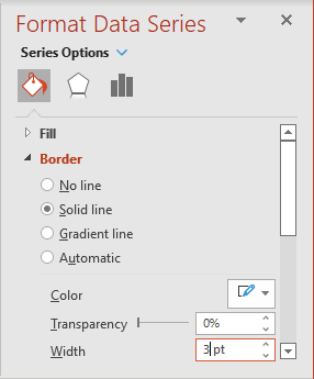
5.7. On the Format Data Series pane, on the Fill & Line tab:
- In the Fill section, choose No fill:

- In the Border section, choose Solid fill, select white color, and increase the width in the Width field:
5.8. Format chart area:
5.8.1. Right-click on the chart area and choose Format Chart Area... in the popup menu:
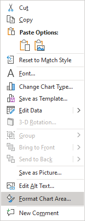
5.8.2. On the Format Chart Area pane, on the Fill & Line tab:
- In the Fill section, choose No fill
- In the Border section, choose No line:

6. Positioning the charts to show parts:

Make any other adjustments to get the look you need.
See also this tip in French: Comment créer un diagramme à secteurs de progression PowerPoint.
