How to create step chart in Excel
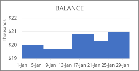
- A column or bar chart gives a correct representation,
- An area chart or any kind of line or scatter chart looks strange:
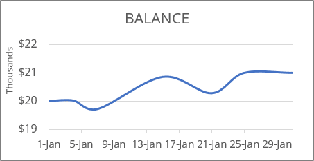
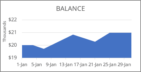
Why is this strange? It looks like the data changes every day (month, year). For this example, you seem to deposit or withdraw some amount daily.
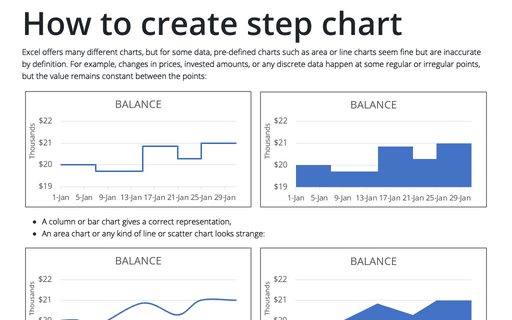
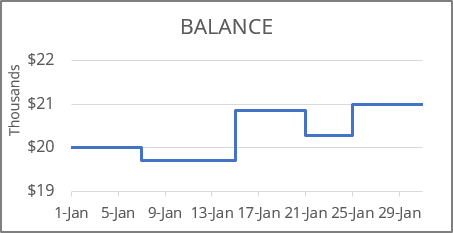
To display discrete data, you can create a step chart (also known as a stepped line chart) where values change discretely at specific points. In other words, a step chart is a specialized line chart that uses only vertical and horizontal lines to connect the data points.
1. Create additional data
To create a correct step chart in Excel, you need to make one simple additional step - add the intermediate data. There are three ways how to add this data:
For example, if the data for the chart looks like this:
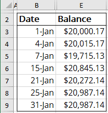
For a step chart, you will need two values for the same date (for example, the January 4th):
- The initial value should equal to the preceding date value - the value before the change.
For this example, = $20,000.17 is the value on January 1st.
- The end value should be equal to the current value - the value after the change.
For this example, = $20,015.17.
I. Manually add an initial point for each date
Copy each date for which you want to add a vertical line. For each date, copy the previous value.
For this example:
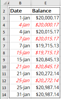
II. Copy and slide date range
II.1. Select and copy the data range somewhere.
In this example, to the cell G2:H9:
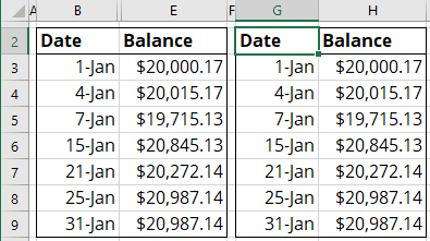
II.2. Delete the first date in the copied data range:
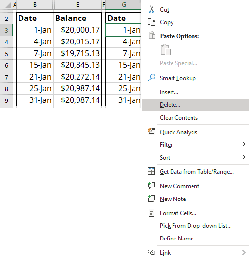
II.2.1. Select the cell with the first date.
II.2.2. Right-click on the selection and choose Delete in the popup menu:
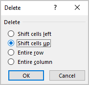
II.2.3. In the Delete dialog box, select the Shift cells up option:
II.2.4. Delete the last cell without a date:
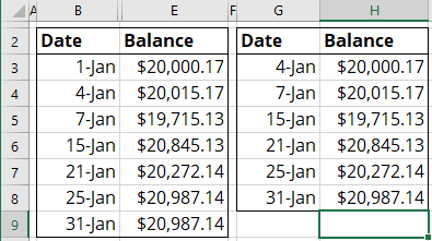
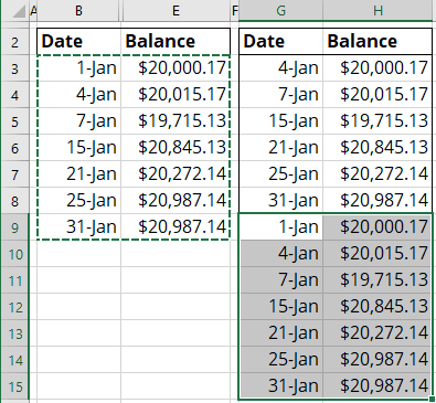
II.2.5. Copy the original data range without headings and paste it below the copied data range:
III. Define names
III.1. On the Formulas tab, in the Defined Names group, click Define Name (see how to create and use named ranges for more details):

III.2. In the New Name dialog box, define:
1) The first range of dates:
- In the Name field, enter the name of this new range, for example, Dates1,
- In the Refers to field, select the dates from the second to the last:
In this example, B4:B9:

2) The second range of dates:
- In the Name field, enter the name of this new range, for example, Dates2,
- In the Refers to field, select the dates from the first to the last:
In this example, B3:B9.
3) The first range of values:
- In the Name field, enter the name of this new range, for example, Values1,
- In the Refers to field, select the values from the first to the second last, without the last value:
In this example, E3:E8:

4) The second range of values:
- In the Name field, enter the name of this new range, for example, Values2,
- In the Refers to field, select the values from the first to the last:
In this example, E3:E9.
Notes:
- The dates in the source data range must be sorted in ascending order. Otherwise, the step chart may not be created correctly.
- Excel creates step charts only for line and area charts and data ranges with dates on the horizontal (category) axis.
2. Create a chart in Excel
To create a step chart, do the following:
2.1. Select the data range.
- Manually add an initial point for each date: B2:B14, E2:E14,
- Copy and slide date range: G2:H15,
- Define named ranges: B2:B9, E2:E9 (the source data range) that will be changed later.
2.2. On the Insert tab, in the Charts group, click the Insert Line or Area Chart button:

From the Insert Column or Bar Chart dropdown list, select any type of chart you need:
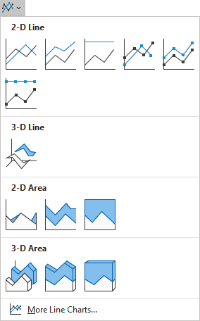
Excel creates a simple line or area chart:
- For the manually added or copy-pasted ranges:

- For the defined names:

3. Create a stepped chart with the defined names
3.1. Do one of the following:
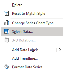
- On the Chart Design tab, in the Data group, choose Select Data:

- Right-click on the chart data series and choose Select Data... in the popup menu:
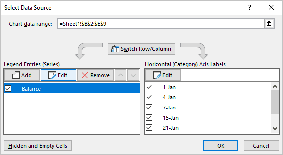
3.2. In the Select Data Source dialog box, under Legend Entries (Series), click the Edit button:
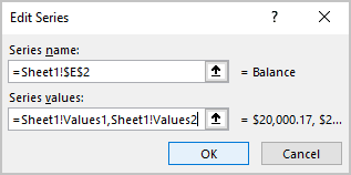
3.3. In the Edit Series dialog box, in the Series values field, type the defined names created for values (in this example, Values1, Values2), then click OK:
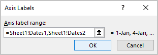
3.4. In the Select Data Source dialog box, under Horizontal (Category) Axis Labels, click the Edit button.
3.5. In the Axis Labels dialog box, type defined names created for dates (in this example, Dates1, Dates2), then click OK twice:
Excel rebuilds the chart to stepped one.
See also this tip in French: Comment créer un graphique en étapes dans Excel.
