Creating a chart with critical zones
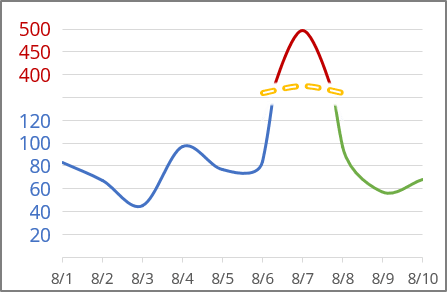
E.g., if you have data like this:
To create the chart with broken data, do the following:
1. Add additional data for this chart - in this example:
- column D to show data before broken line
- column E to show data after broken data
- column F to show the biggest data
- column G for the broken line.
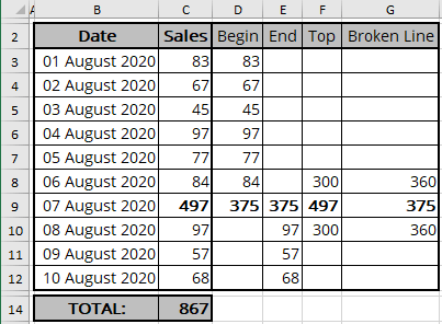
2. Select all necessary data - in this example, B2:B12, D2:G12.
3. On the Insert tab, in the Charts group, select launch or click on the Recommended Charts button:

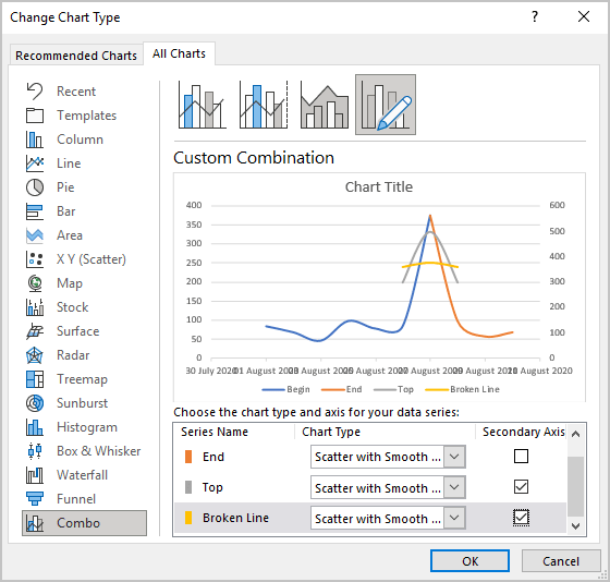
4. In the Insert Chart dialog box, on the All Charts tab, select the Combo group and then choose Custom Combination:
- For all series, choose Scatter with Smooth Line chart type
- For the Top and Broken Line data series, check Secondary Axis:
5. Double-click in the primary vertical axis, and then in the Format Axis task pane, make all changes you prefer for this series. For this example:
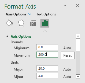
6. Double-click in the secondary vertical axis, and then in the Format Axis task pane, make all changes you prefer for this series. For this example:

7. To hide parts of the lines, select the part of the line, and choose Gradient Fill for it:
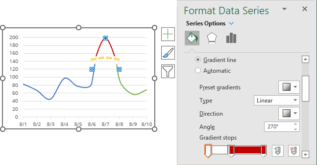
See more about gradient filling.
8. Make adjustments for Vertical Axes; do one of the following:
- To hide values of both Axes, on the Format Axis task pane, on the Axis Options tab, in the Labels group, for Label Position choose None for every axis:
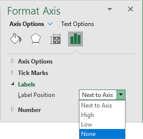
Instead of hidden values, you can add a text box to the data you want:

- Instead of adding a text box to the chart, you can add the new data series with labels to substitute axis labels. See how to customize the vertical axis labels.
Make any other adjustments to get the look you desire.
See also this tip in French: Comment démontrer les zones critiques du graphique.

