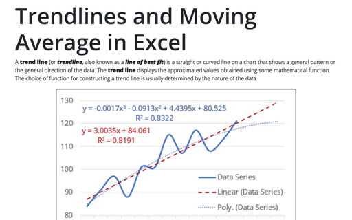
Trendlines and Moving Average in Excel

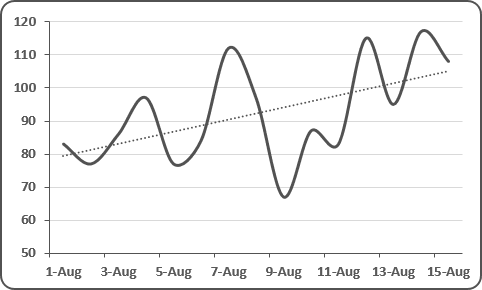
Excel makes adding a trend line to a chart quite simple. To add a trendline, select the data series and do one of the following:
- Select a data series, Excel displays the Chart Tools, adding the Design and
Format tabs:

Under Chart Tools, on the Design tab, in the Chart Layouts group, click the Add Chart Element icon and choose Trendline list:

- In the popup menu select Add Trendline...:

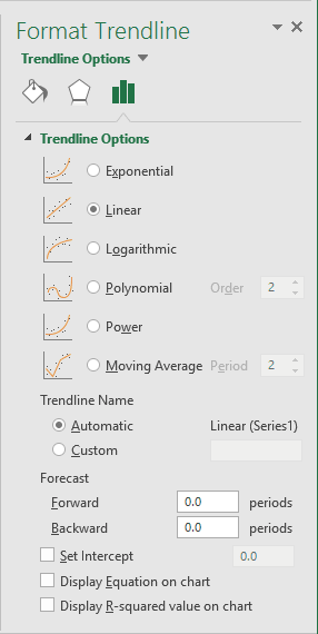
The type of trend line that you choose depends on your data. Linear trends are most common, but some data can be described more effectively with another type. If necessary, you can fine-tune the trendline settings from the Format Trendline pane:

One of the options in the Trendline Options group is Moving Average, which is useful for smoothing out data that has a lot of variation (that is, "noisy" data). The Moving Average option enables you to specify the number of data points to include in each average. For example, if you select 5, Excel averages every five data points.
The Trendline Options group enables you to specify a name to appear in the legend and the number of periods that you want to forecast. Additional options let you set the intercept value, specify that the equation used for the trend line should appear on the chart, and choose whether the R-squared value appears on the chart.
Delete a trendline
Click the trendline you want to delete and then press Delete.
See also this tip in French: Comment ajouter une courbe de tendance.

