How to create a Bullet chart in Excel

The author of the bullet graph used varying intensities of a single hue for the qualitative ranges, but you can use any colors you like (see rainbow thermometer charts).
To create a bullet chart like one above, do the following:
1. Prepare the data:
1.1. To create a bullet graph, you will need several different data ranges:
- The target
- The actual or current value
- The qualitative ranges
For example:

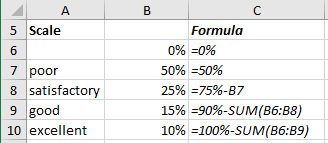
1.2. Create the qualitative ranges (see rainbow thermometer charts for more details):
For example, using the "poor", "satisfactory", "good", and "excellent" value ranges which are distributed as follows:
2. Create qualitative ranges:
2.1. Select the data (in this example, B6:B10).
2.2. On the Insert tab, in the Charts group, click the Column button:

From the Column dropdown list, select the 100% Stacked Bar
 chart.
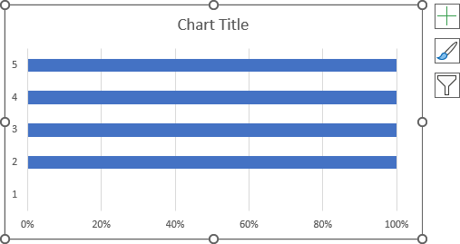
Excel creates the chart with an odd look:
2.3. Modify the chart:
2.3.1. Do one of the following:
- Under Chart Tools, on the Design tab, in the Data group, choose
Select Data:

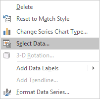
- Right-click in the chart area and choose Select Data... in the popup menu:
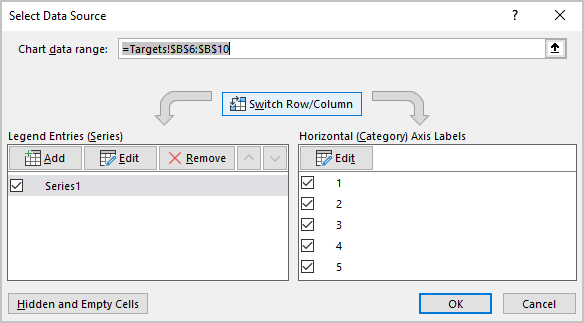
2.3.2. In the Select Data Source dialog box, click the Switch Row/Column button:
Add any other adjustment that you find useful to the qualitative ranges:

3. Add the data with the current value and the Target to the chart:
3.1. Prepare the new data:
The Target and the Actual (current) value, in Microsoft Excel, can be added in different ways:
- create another chart and place it above this one (see Combining several charts into one chart),
- add the new bar chart which contains both of these values:

- The Target defined at the point of 90%, in the interval between "good" and "excellent" zones. Use 2% to display the Target as a thicker line.
- The Actual (current) value is a percentage of the Target.
- Zone 1 is equal to the Actual value if the Actual value is less than the Target.
- Zone 2 is equal to the difference between the Target and the Actual value if the Actual value is less than the Target.
- Zone 3 is the difference between the Actual value and the Target if the Target is less than the Actual value.
3.2. Select the newly added values (in this example, D6:E10).
3.3. Copy then to the Clipboard (by pressing Ctrl+C).
3.4. Select the chart.
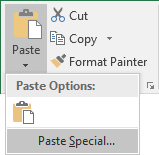
3.5. On the Home tab, in the Clipboard group, select the Paste dropdown list and then choose the Paste Special...:
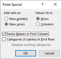
3.6. In the Paste Special dialog box:
- In the Add cells as group, ensure that the New series radio button is selected,
- In the Values (Y) in group, select the Rows radio button,
- Select the Series Names in First Column checkbox,
- Unselect the Categories (X Labels) in First Row checkbox:
Excel updates the chart after adding the new data series, and you need to fix the formatting:

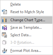
3.7. Right-click on the chart and choose Change Chart Type... in the popup menu:
3.8. In the Change Chart Type dialog box:
- Select the Combo tab,
- Check the Secondary Axis checkbox for all newly added data series.
4. Format new data series:
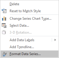
4.1. Select any of the new data series and choose Format Data Series... in the popup menu:
4.2. On the Format Data Series pane:
- On the Series Options tab, set the appropriate value in the Gap Width field
to display these data series narrower than the qualitative ranges:

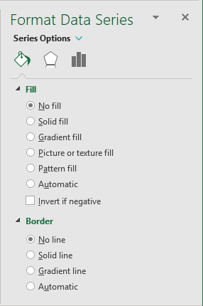
- To hide data series, select them and on the Fill & Line tab, hide this data series:
- In the Fill section, choose the No fill option,
- In the Border section, choose the No line option:
Add any other adjustment.

