Creating a Candlestick Stock chart
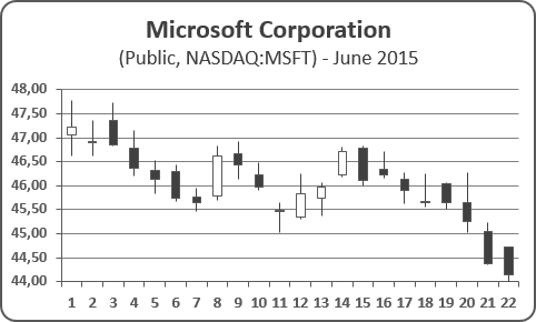
To create a Candlestick chart in Excel 2016, do the following:
1. Depending on the type of stock chart you want to create, you must include a specific combination of data series in your worksheet - and put the data series in order:
- High-Low-Close:
- High price
- Low price
- Closing price
- Open-High-Low-Close:
- Opening price
- High price
- Low price
- Closing price
- Volume-High-Low-Close:
- Volume traded
- High price
- Low price
- Closing price
- Volume-Open-High-Low-Close:
- Volume traded
- Opening price
- High price
- Low price
- Closing price
2. Select the data range (in this example, D6:G27, the data from Google Finance):
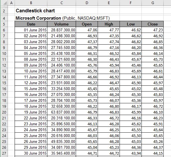
3. On the Insert tab, in the Charts group, choose the Waterfall or Stock Chart button and then select the Stock group:

Choose Open-High-Low-Close: 
4. Do one of the following:
- Under Chart Tools, on the Design tab, in the Data group, choose Select Data:

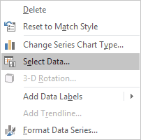
- Right-click in the chart area and choose Select Data... in the popup menu:
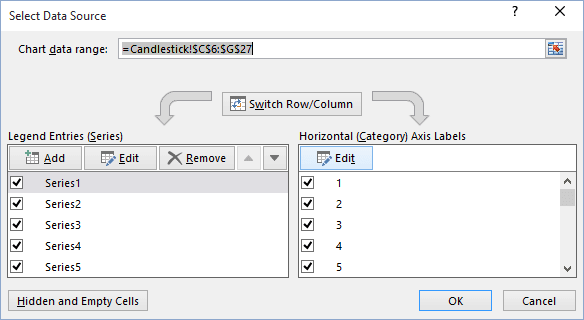
5. In the Select Data Source dialog box, in the Horizontal (Category) Axis Labels group, click the Edit button:
6. In the Axis Labels dialog box, select the data range (in this example, B6:B27):
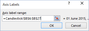
7. Click OK twice.
8. Right-click one of the years along the category axis. In the popup menu, select Format Axis... to open the Format Axis on the Format task pane. On the Axis Options tab:
- In the Axis Type group, select the option Text axis:

- In the Number group, choose Custom in the Category field and then
change the field Format Code (for example, to show only days) and click the Add
button:

You can then make any other adjustments to get the look you desire.
See also this tip in French: Comment créer un graphique chandelier japonais ou un graphique boursier.

