6 charts for lively progress visualization
1. Simple gauge or speedometer chart
This simple chart resembles a speedometer gauge and displays a value between 0 and 100%:

See Creating a gauge chart for more details.
2. Simple bar chart
You're probably familiar with a thermometer type display that shows the percentage of a task that's completed:

See Creating a simple thermometer chart for more details.
3. Glossy thermometer chart
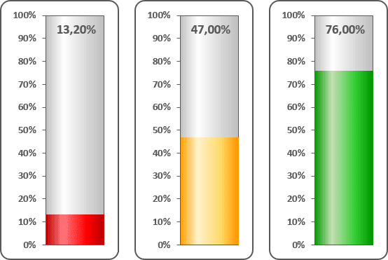
Thermometer chart is nice indicator of the process with well-defined measure, e.g. task status. You can create more interesting thermometer chart in Excel:

See Creating a glossy thermometer chart for more details.
4. Semaphore chart
Data visualization is a key cognitive tool that enables you to attract more attention to your statements. E.g., you can direct your organization attention to insufficiently developed goals and praise them for successfully performed goals:

See Creating a semaphore thermometer chart for more details.
5. Rainbow chart
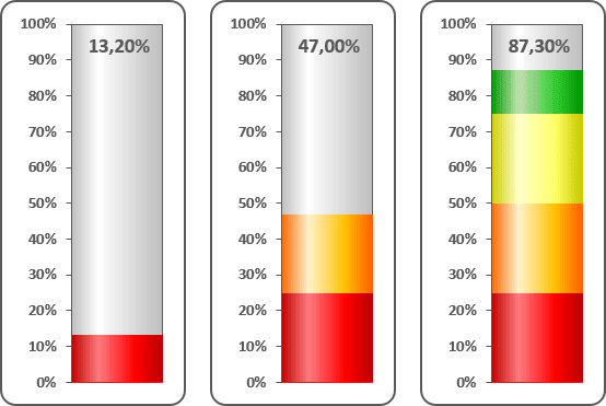
Creating a thermometer chart, you are not limited to a single-color bar. Instead you can specify different colors for different value intervals:

See Creating a rainbow thermometer chart for more details.
6. Cocktail chart
Do you want to make your annual company performance meeting less boring? Create a funny cocktail chart for it! E.g., you can mix in a glass percentages of department contribution to the company revenue:

See Funny thermometer Cocktail chart for more details.
See also this tip in French: 6 graphiques pour une visualisation dynamique des progrès.

