Chart in Excel 365
How to add a vertical line to the scatter chart
Vertical lines are usually added to the chart to highlight the current date, a critical date, or a deadline. There are many ways to add a vertical line to the existing chart. Errors bars are the easiest way to add a vertical line to a scatter plot. See how to add a vertical line to a line or bar chart or a horizontal line to a scatter plot, line, or column chart:
How to select an invisible element in the chart
Some chart elements are hard to find for customization, or they are not visible at all. For example, added or updated data series may not be visible due to chart settings: located in an invisible data range, displayed with invisible markers, with disabled fill color, or because of the background image:
Format trendlines and Moving Average
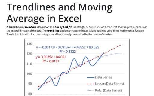
It is simple as ABC to add one or multiple trendlines in Excel. A bewildering task is to choose the trendline type that best corresponds to the data series and, if needed, format data to create correct trends, forecasts, etc. Excel adds trendlines with the default formatting and values, such as the default value Period = 2 for the Moving Average.
Trendlines and Moving Average in Excel
A trend line (or trendline, also known as a line of best fit) is a straight or curved line on a chart that shows a general pattern or the general direction of the data. The trend line displays the approximated values obtained using some mathematical function. The choice of function for constructing a trend line is usually determined by the nature of the data.
Creating a chart with critical zones
Periodical processes like the volume of support service calls often have critical zones that indicate a severe problem that needs to be investigated and mitigated. This tip shows how to reveal and emphasize those critical zones for analysis.
6 charts for lively progress visualization
There are several different charts in Excel that can help you to create a perfect progress illustration.
How to create two horizontal axes on the same side
While the secondary vertical axis provides a way to display two different types of data for the one time range, the secondary horizontal axis allows you to create a chart showing two data series for different time ranges:
How to create two vertical axes on the same side
If you need to display two different data series for the one- or compatible-time ranges that have different value scales, you can add the secondary vertical axis:ß
How to create a span chart in Excel
Span chart, also known as a range graph, floating graph, difference graph, high-low graph, shows dataset ranges between a minimum value and a maximum value:
How to create a box and whisker plot in Excel
When you work with some statistical data such as lifespan, weight, or height of the specific type of pets, you have different charts and diagrams to compare them. The box and whisker chart is one of the useful graphical representation of statistical data that that shows the median, quartiles, and extreme values at one plot.


