How to create an Arc length chart in PowerPoint
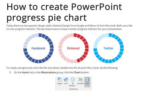
This tip is about some tricks on how to create an Arc length chart:
 or
or

To create a progress Arc length chart, do the following:
1. On the Insert tab, in the Illustrations group, click the Chart button:

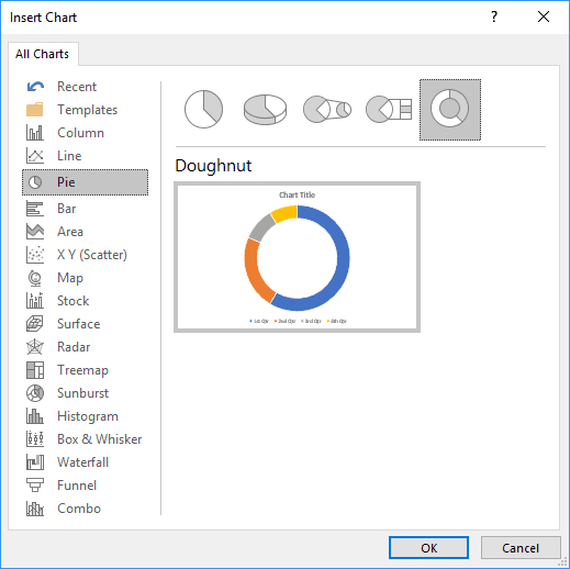
2. In the Insert Chart dialog box, on the Pie tab, choose the Doughnut chart:
3. In the Chart in Microsoft PowerPoint dialog box:
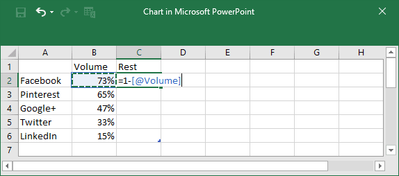
3.1. Enter as many streams of your doughnut chart as you want, and with volumes, you need:

3.2. Add the new column with formulas:
4. Under Chart Tools, on the Design tab, in the Data group, click on the Select Data button:

5. On the Select Data Source dialog box, click on the Switch Row/Column button:
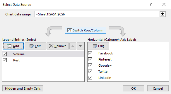
PowerPoint changes your data like in the chart below:
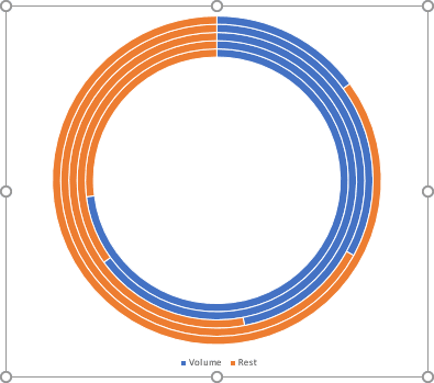
6. Change the width of the pie chart layers:
6.1. Right-click on your chart data and choose Format Data Series... in the popup menu:
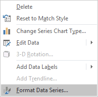
6.2. In the Format Data Series pane, on the Series Options tab, choose the volumes of the following fields:
- Angle of first slice, for example:


- Doughnut or Point Explosion (it is visible only for the top layer), for example:


- Doughnut Hole Size, for example:


7. Hide unneeded data:
7.1. Right-click on any slice of the data, which you want to hide, and select Format Data Point... in the popup menu:
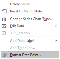
7.2. In the Format Data Point pane, on the Fill & Line tab, in the Fill section, choose No fill:
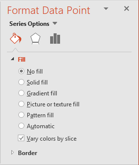
7.3. Repeat the previous step for all data points you want to hide:

Make any other adjustments to get the desired appearance.
See also this tip in French: Comment créer le diagramme circulaire de progrès dans PowerPoint.

