How to create seven elements graph or seven factors diagram
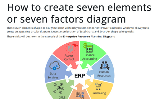
These tricks will be shown in the example of the Enterprise Resource Planning Diagram:

1. Add the doughnut chart with seven parts (just like an example):
1.1. On the Insert tab, in the Illustrations group, click the Chart button:

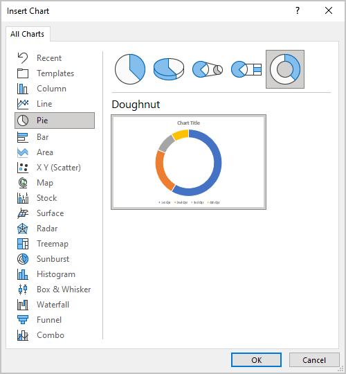
1.2. In the Insert Chart dialog box, on the Pie tab, choose the Doughnut chart:
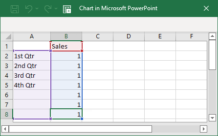
1.3. In the Chart in Microsoft PowerPoint dialog box, enter as many parts of your doughnut chart as you want, and in the proportions you like:
The doughnut chart will look like:
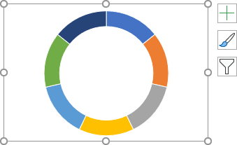
1.4. Format the doughnut as you want:
1.4.1. Right-click on the chart and choose Format Data Series... in the popup menu:
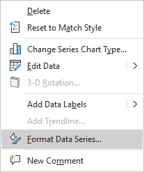
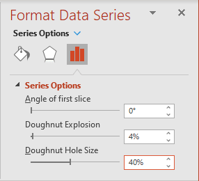
1.4.2. On the Format Data Series pane, on the Series Options tab, choose Doughnut Explosion and Doughnut Hole Size:
1.4.3. Add labels, pictures, and any other adjustments you like:

2. Create the centered picture:
2.1. On the Insert tab, in the Illustrations group, click the Shapes dropdown list and then choose the oval shape from the Basic Shapes group:
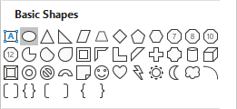
2.2. Make the size of this oval shape enough to fill the center of your doughnut chart:

2.3. To help to create seven arrows, on the Shapes dropdown list, in the Stars and Banners group, select the Star: 7 Points shape:

Positioning this shape in the center of the circle shape:
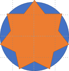
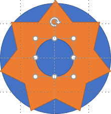
2.4. Add the second oval shape:
2.5. Add the arrow shapes:
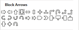
2.5.1. On the Shapes dropdown list, in the Block Arrows group, select the Arrow: Down shape:
2.5.2. Add shapes from the ray of the star shape to the smallest circle:
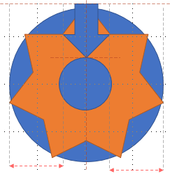
2.5.3. Copy the arrow, rotate it, and position it from the next ray to the centered circle:
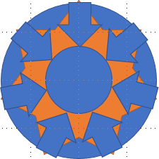
2.5.4. Remove the helping shapes:
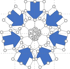
2.6. Format arrows and position them in the chart:

Note: To rotate all shapes, select them and group (on the Shape Format tab, in the Arrange group, select Group dropdown list and then click Group).
See also How to select and format objects in the slide with a big number of objects.
See also this tip in French: Comment créer un graphique à sept éléments ou un diagramme à sept facteurs.
