How to create a combination chart in PowerPoint
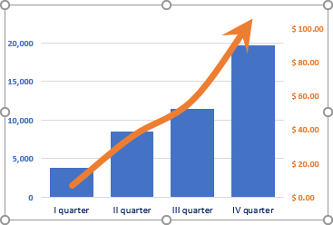
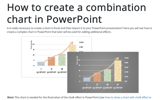
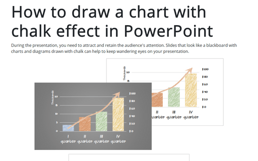
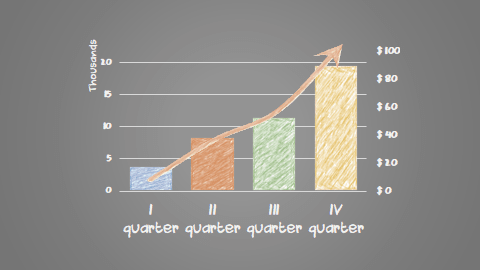
Note: This chart is needed for the illustration of the chalk effect in PowerPoint (see How to draw a chart with chalk effect in PowerPoint):
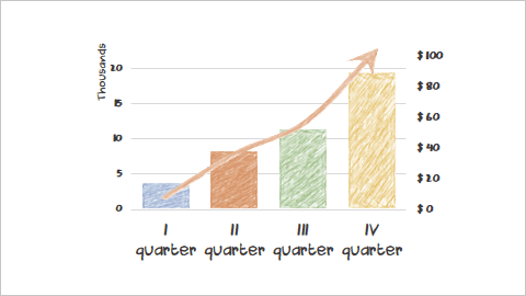
To create a combination chart in PowerPoint, do the following:
1. On the Insert tab, in the Illustrations group, click the Chart button:

2. In the Insert Chart dialog box, select the chart type you prefer.
For example, on the Column tab, select the Clustered Column chart:
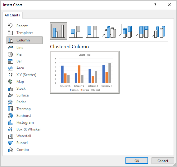
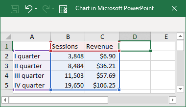
3. In the Chart in Microsoft PowerPoint dialog box, type or insert chart data.
For this example:
PowerPoint creates a chart for the data:
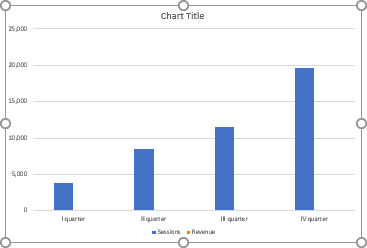
4. To show the second data series as a line, do the following:
4.1. Right-click in the chart plot area and choose Change Chart Type... in the popup menu:
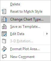
4.2. In the Insert Chart dialog box, select the Combo tab and then:
- Choose a Custom Combination chart,
- For the second data series, choose Line in the Chart type column and check the Secondary Axis checkbox:
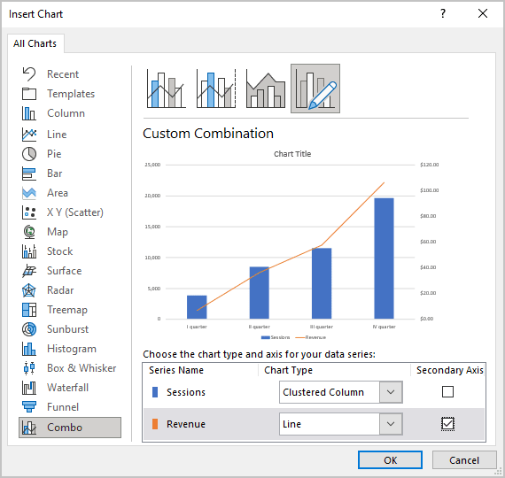
5. Remove the legend and modify axes as you like.
6. To add an arrow for the line data series, select it and do the following:
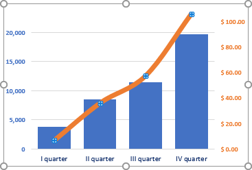
6.1. Right-click on the selected data series and choose Format Data Series... in the popup menu:
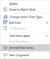
6.2. On the Format Data Series pane, on the Fill & Line tab, in the Line section:
- Choose the arrow type you prefer in the End Arrow type dropdown list.
For example, Stealth Arrow:

- Choose the arrow size you prefer in the End Arrow size dropdown list.
For example, Arrow R Size 9:

Add any other adjustments you like.
