Creating a Candlestick Stock chart with volume
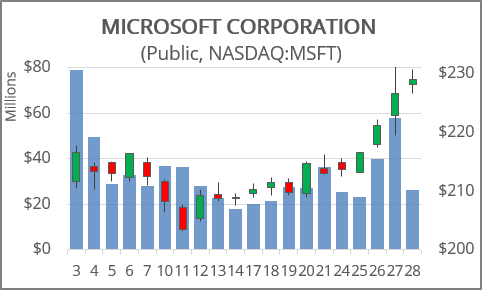
To create a Candlestick chart in Excel for Microsoft 365, do the following:
1. Depending on the type of stock chart you want to create, you must include a specific combination of data series in your worksheet - and put the data series in order:
- High-Low-Close:
- High price
- Low price
- Closing price
- Open-High-Low-Close:
- Opening price
- High price
- Low price
- Closing price
See also Creating a Candlestick Stock chart.
- Volume-High-Low-Close:
- Volume traded
- High price
- Low price
- Closing price
- Volume-Open-High-Low-Close:
- Volume traded
- Opening price
- High price
- Low price
- Closing price
2. Select the data range (in this example A2:F22, the data from Yahoo Finance):
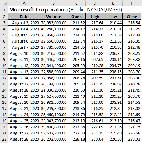
Note: Make sure the data columns are set in order Volume-Open-High-Low-Close.
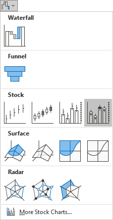
3. On the Insert tab, in the Charts group, choose the Insert Waterfall, Funnel, Stock, Surface, or Radar Chart button:

In the Insert Waterfall, Funnel, Stock, Surface, or Radar Chart drop-down list, in the Stock group, choose Volume-Open-High-Low-Close:
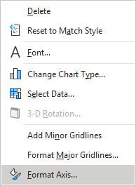
4. Right-click on the category axis, then select Format Axis... in the popup menu (or double-click the axis):
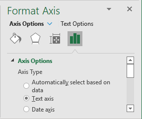
5. On the Format Axis pane, on the Axis Options tab:
- In the Axis Type group, select the option Text axis:
- In the Number group, choose Custom in the Category field and then change the field Format Code (for example, to show only days) and click the Add button:

You can then make any other adjustments to get the look you desire.
See also this tip in French: Comment créer un graphique chandelier japonais ou un graphique boursier avec volume.

