How to create an axis with subcategories
Excel
365
Excel offers a lot of different tricks to create great informative charts and diagrams. A lot of
the useful adjustments related to the axis. E.g., you can hide an axis, use primary and
secondary axis, change the presentation of data on the axis, etc.
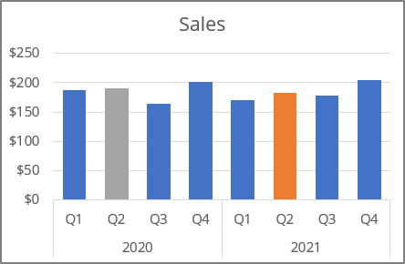
One of such tricks is showing an axis with subcategories:
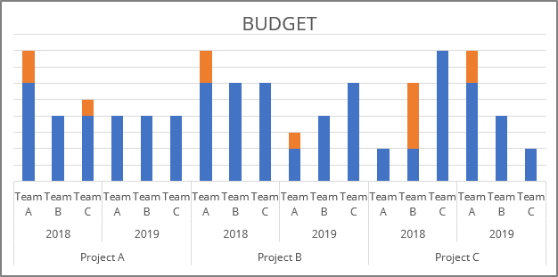
To create an axis with subcategories, do one of the following:
- If you have a data with structured categories, just select them and create
the chart you like:

Excel automatically "understands" the structured data as axis data with subcategories:

- If you already have a chart, do the following:
For example:
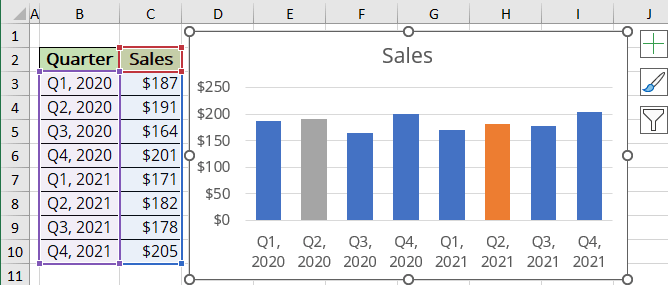
1. Add the new category or subcategory to your data.
For this example:
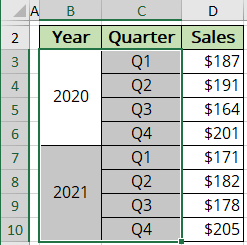
2. Do one of the following:
- On the Chart Design tab, in the Data group, choose Select Data:

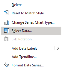
- Right-click on the chart area and choose Select Data... in the popup menu:
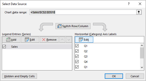
3. In the Select Data Source dialog box, under Horizontal (Category) Axis Labels, click the Edit button:
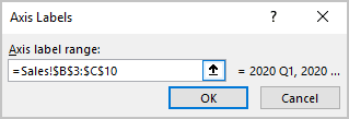
4. In the Axis Labels dialog box, choose cells with categories and subcategories for this axis and click OK several times:
Excel changes an axis:
