How to create a Marimekko chart or Mekko chart in Excel
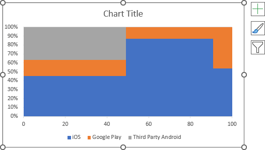
E.g., the Marimekko chart simplifies the analysis of the relative market size for the mobile app market and the share of the app platform within the specific market.

The horizontal axis shows which fraction of the market corresponds to the particular region, and the vertical axis shows the partitioning of the region.
Excel does not have Marimekko chart tools, but you still can create one of your own:
1. Create a step Area chart (see more about step charts).
2. Add the horizontal and vertical separators (vertical lines) to simulate the mosaic (see How to add separators into the Marimekko chart).
3. Add labels to the chart (see How to add labels to the Marimekko chart).
For example, for the Global App Market 2018:
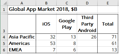
To create a step Area chart of the data, do the following:
Prepare the new data for the chart
1. To create a step Area chart, add two copies of values for the same data:
- the start value (previous value),
- the end value (current value).
For this example:
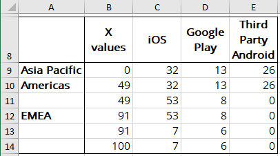
where, X values are calculated as the width of each data column, including 0 and 100%:
- the first value (0%),
- the width of the first data series (percentage of the total for this data series):
= E4 / SUM (E4:E6),
= 71 / (71 + 61 + 13) = 49,
- the width of the first and second data series (percentage of the total for the data series):
= (E4 + E5) / SUM (E4:E6),
= (71 + 61) / (71 + 61 + 13) = 91,
- the last value (100%).
Create a step Area chart
2. Select a new data range (in this example, C8:E14).
3. On the Insert tab, in the Charts group, click on the Insert Line or Area Chart dropdown list:

From the Insert Line or Area Chart dropdown list, select 100% Stacked Area:
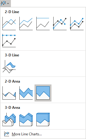
Excel creates a little weird area chart for your data:
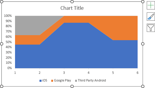
Customize the horizontal axis
4. Do one of the following:
- On the Chart Design tab, in the Data group, choose Select Data:

- Right-click in the chart area and choose Select Data... in the popup menu:
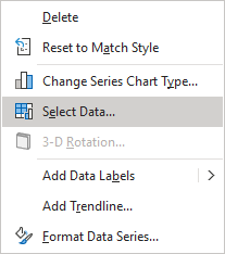
In the Select Data Source dialog box:
- Under Horizontal (Category) Axis Labels, click the Edit button:

- In the Axis Labels dialog box, choose cells with categories for the horizontal axis (for this example, B9:B14), then click the OK button several times:

Format the horizontal axis
5. Right-click on the horizontal axis and choose Format Axis... in the popup menu:
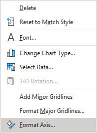
On the Format Axis pane, on the Axis Options tab, in the Axis Options section:
- Under Axis Type, select the Date axis option,
- Under Bounds, be sure that:
- In the Minimum field, the value is the 1st day in Excel:
- 00/01/1900, if you use the date format mm/dd/yyyy,
- 01/00/1900, if you use the date format dd/mm/yyyy,
- In the Maximum field, the value of the 100th day in Excel
(the 4th of September):
- 09/04/1900, if you use the date format mm/dd/yyyy,
- 04/09/1900, if you use the date format dd/mm/yyyy,
- In the Minimum field, the value is the 1st day in Excel:
- Under Units, type 20 days for the Major units:
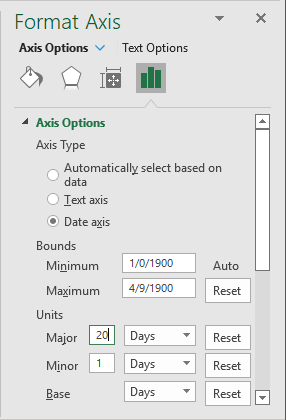
Excel changes the chart to the step Area chart:
To add the horizontal and vertical separators (lines), to simulate the mosaic, see How to add separators into the Marimekko chart.

