Combining several charts into one chart
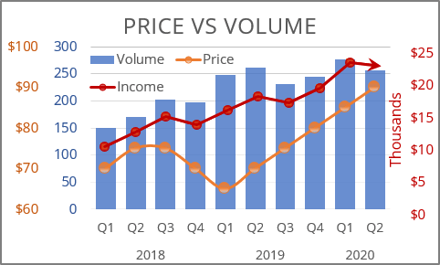
If you need to create a chart that contains only one primary and one secondary axes, see Using two axes in the one chart.
Excel uses only two axes in one chart: primary and secondary. If you want to use another axis, you can create another chart and add it to your first chart. To do this, follow the next steps:
1. Select the data range (in this example, B3:B13 and E3:E13):
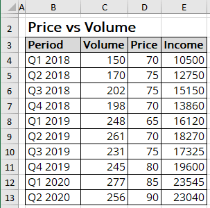
And create a chart that you want. For example:
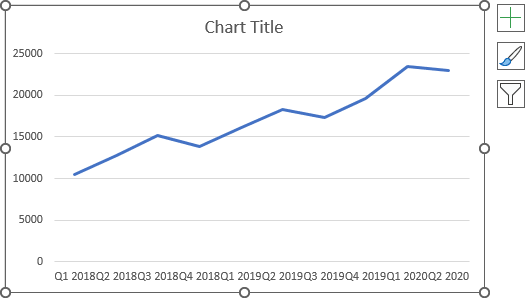
2. Delete the horizontal axis and modify the vertical axis:
2.1. To delete the horizontal axis, select it and press Delete.
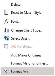
2.2. Right-click the horizontal axis and choose Format Axis... in the popup menu (or double-click the axis):
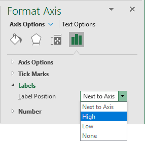
On the Format Axis pane, on the Axis Options tab, in the Labels group, in the Label Position list, choose High to display the axis labels on the right side:
Make other adjustments to get the style you want:
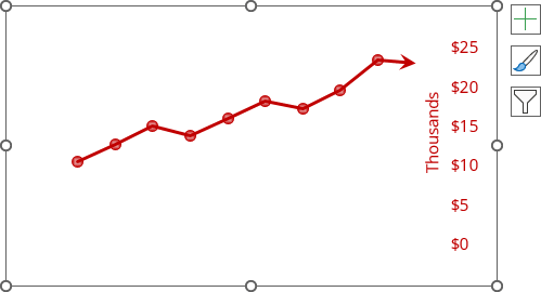
Note: To display the units, do the following:
- On the Format Axis pane, on the Axis Options tab, in the Axis Options group, from the Display units list, choose the needed value:

- Make sure that the option Show display units label on chart is selected.
For this example:

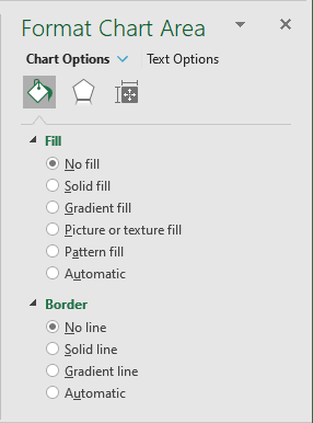
3. Right-click on the chart area and choose Format Chart Area... in the popup menu:
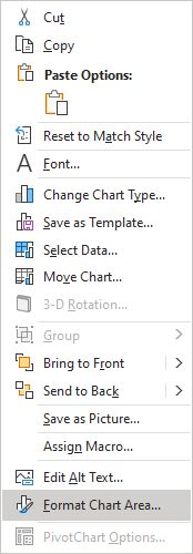
4. On the Format Chart Area pane:
- In the Fill section, select the No fill checkbox,
- In the Border section, select the No line checkbox:
5. If necessary, right-click on the chart plot area and choose Format Plot Area... in the popup menu. On the Format Plot Area pane:
- In the Fill section, select the No fill checkbox,
- In the Border section, select the No line checkbox.
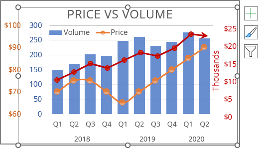
6. The hardest step: Modify the first chart to create a space in the right part of the chart and move the second chart to create a more interesting chart:
See also this tip in French: Comment combiner plusieurs graphiques dans le graphique.
