How to add a horizontal line to the chart
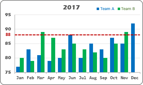
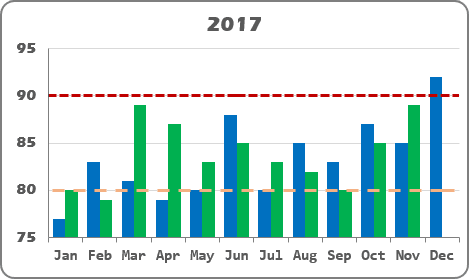
To add a horizontal line to your chart, do the following:
1. Add the cell or cells with the goal or limit (limits) to your data, for example:
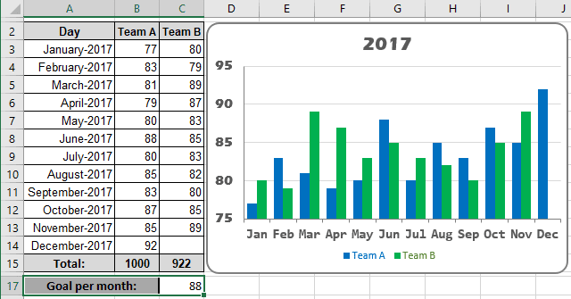
2. Add a new data series to your chart by doing one of the following:
- Under Chart Tools, on the Design tab, in the Data group, choose Select Data:

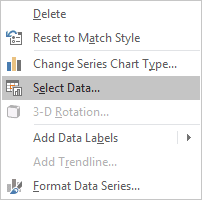
- Right-click in the chart area and choose Select Data... in the popup menu:
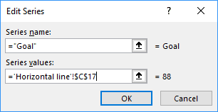
In the Select Data Source dialog box, click the Add button and in the Edit Series dialog box, type:
- In the Series name box - the name of this line (Goal),
- In the Series values box - the cell with the goal ($C$17):
3. If it is necessary, change data series:
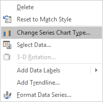
3.1. Right-click in the new data series and choose Change Series Chart Type... in the popup menu:
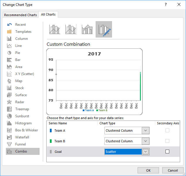
3.2. In the Change Chart Type dialog box, choose the Scatter type:
3.3. Repeat step 2 to change the data series:
In the Select Data Source dialog box, select the added data series and click the Edit button, then in the Edit Series dialog box:
- In the Series X values box - add any cell from the horizontal (category) axis (for example, $A$8):
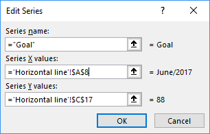
You will see the correct data for the same horizontal (category) axis:
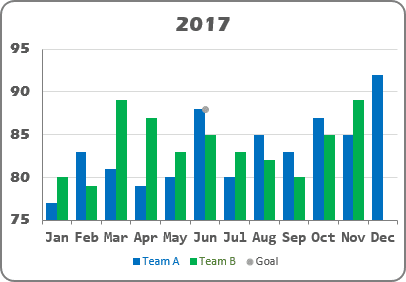
4. Under Chart Tools, on the Design tab, in the Chart Layouts group, click the Add Chart Element icon and choose the Error Bars list:
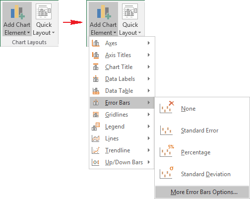
Excel proposes several error bars; also, you can use More Error Bars Options.... If necessary, you can fine-tune the error bar settings from the Format Error Bars pane:
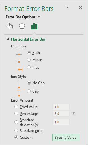
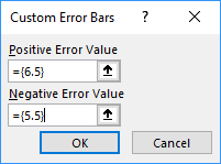
To specify the length of the error line, click on the Specify Value button, and type the appropriate value for negative and positive values. For this example:
You can then make any other adjustments to get the expected look.
See also this tip in French: Comment ajouter une ligne horizontale au graphique.

